Wednesday, December 13, 2017

Mod 16

1. What were you expectations for this course and where they met?

 My expeactations for this class was to learn about art as a whole and throughout the course between the visits and the online work, I believe that I did dramatically increase my knowledge on what art is.
2. Now that you've been through this course, What is art? How would you define it now compared to your intial posting?

Art to me is a lot of things, I think the biggest impact is that it is so braod that you can be very creative with it, compared to my initial posting, art now in my mind is much more understood when it comes to all the different types of areas that art can belong to. 
3. Who was your favorite artist in your original posting and who is your favorite visual artist now? If there is a difference, why do you think so? If you have the same favorite artist, why do you think so?

My initial posting my favorite artist was Van Gogh and after the semester it hasnt changed. I think now I just have a better understanding of what he did and how we created his pieces compared to when I first started. 
4. Now that you've completed this course, how do you feel about taking an online course? Is your answer the same as it was in your first posting? How is it the same or different?

I liked taking and online course in th beginning and I still like it now. I believe that having the freedom to finish a class generally at my own pace and learning about what the course has to offer in my own way makes things easier to understand. 

Saturday, December 9, 2017

Extra Credit

1. Which assignment did you ENJOY working on the best? Why?
My favorite assignment this year was the one with creating our own exhibit because I found an exhibit I absolutely loved and it allowed me to be creative to my fullest extent!
2. Which assignment did you ENJOY working on the least? Why?

The assignment I enjoyed the least was project two and responding to art work. I didn't like the fact I had to try to come up with responses to art work if I didn't connect with it. It made the assignment harder because I was limited. 
3. How did you like using BLACKBOARD?

I think the way you had balckboard set up worked well, I didn't have many problems after I learned the way you like to present the assignments. 

4. What is your opinion of the Discussion Groups in this course?

To be brutally honest, in the nicest way possible... I hated the discussion groups, I think at the time the work load in the modules was a lot then on top of that, having to do the discussion groups gave even more work on top of the load we all have with other classes. 

5. Did you participate in any of the extra credit projects in previous modules? If so, what was your opinion of them? (mandala, elgin marbles, culture, art critics)

I did not participate in any previous extra credit projects. 

6. If you had the opportunity to change this course:

What would you keep?: Exhibit project
What would you remove?: Discussion groups and required videos to watch
What would you add? : More art/drawing

7. Would you recommend this course to your peers? Yes, absolutely.

8. Please list any other comments you would like to share. 

I would like to say thank you for being very flexible when it came to extensions and caring about the well being of your students. Not many teachers are like that and I truly appreciated you working with me throughout the year!

Self Portrait.

Original Photo:

Drawing: 


Create a reflection journal on your Blog and answer the following questions:

Gallery: Exploring self Portrait. 
Inspiration pictures:

1.)File:Rembrandt Harmensz. van Rijn - Selfportrait - Google Art Project.jpg
Name: Rembrandt
Title: Self portrait
Media: Oil on Copper
Size: 12.2x15.5 cm 
Year: 1630

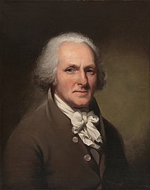
2.)Image result for Charles Willson Peale Self-Portrait
Name: Charles Willson Peale
Title: Charles Willson Peale Self-Portrait
Media: Oil on Canvas 
Size: w721 x h848 x d73 cm (Frame)
Year: 1791

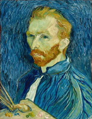
3.)Image result for van gogh self portrait
Name: Vincent Van Gogh
Title: Self-Portrait
Media: Oil on Canvas 
Size: w438.2 x h571.5 cm (overall)
Year: 1889
(I included this one because it is one of the most recognized self portraits in history and I love his work.)

1. Why did you select the inspiration pieces?


The reason I chose these pictures is because when I read this assignment I can think of two things, and its the old pictures of people of significance, where they would sit there and there is not much too them, nothing in the background and you can usually see no facial expression or it is a calm look and also the famous pictures that artists would draw to describe their feelings of the time, but all of these usually never have much expression so that is what I decided to run with. 

2. Why did you select the media to create your self-portrait?


I chose a soft charcoal pencil because it is the easiest media for me to manipulate when it comes to scale, it can also be erased or if you make a mistake it can be fixed. To me it made the most sense and is the safest to use when creating something so specific. 

3. What challenges did you face in creating your self-portrait and how did you overcome them?


The biggest challenge was simply drawing myself and getting the features to look the best I can because it is myself I didn't see myself as what I was drawing and I actually over came this by getting opinions on how to draw a face from youtube videos and followed the the best of my ability. 

4. How does this piece represent you?


This piece represents me because it's simple. I knew doing something crazy wouldn't be me or my style of art. I wanted to show the simplicity of the human face in my drawing because I don't have emotional ties in my life that would sway that. I wanted to draw just my face because to sweater I have on or the background hold no value to the project so I did the best I can to show  you this through the drawing. 

5. What elements and principles of art did you apply in this work?


The biggest element that I tried to apply, is value. The way that face looks in the real photo you can see light hit from the left and it made me think to try and apply value for that reason, to show the different lighting that is on my face. In my photo I did the darker scale on the left so when I send it in it looks like the lighter scale is how it is supposed to be. 

6. Did you enjoy working on this project?


This project was frustrating because I couldn't get it to look like I wanted but I think it is the best I can do. 

7. What do you think of your final artwork?


I think the final artwork shows the best of my abilities, I spent a long time on it trying to make it the best I can so I am proud/happy with what I have, just hopefully more practice in the future will get it to where I would like it to be. 

Art Analysis Project

1. Use the vocabulary you have learned in class to describe this artwork or performance in detail.
In the piece you seen different scale values in the faces that were present. Some are bigger in size and others are smaller, this is most seen between the faces and the animal heads. This piece also has extreme uses of value in the black and white scale. You can see throughout the entire piece there is spots of white that are of objects in the foreground like the faces to completely black in the background with what looks like the cabinet. 
2. What processes were used to create this work? What social influences might the artist be responding to and why? 
Picasso discarded color to intensify drama in this piece. The social influence that Picasso was responding to was that of the Nazis casually bombing Guernica during the Spanish Civil War, to show the tragedies of war and the suffering upon civilian individuals. 
3. What is the relationship of this work to the time and society in which it was created? Describe the symbols used to express this relationship.
The relationship this work brought is that after it was finished it was toured around the world and it brought recognition to what was happening during the Spanish Civil War. He used symbols of the bull and the horse. Picasso stated the the bull was used for brutality and darkness where the horse was the people on Guernica. (Both major symbols in Spanish culture)
4. Identify elements in the work that evoke a persuasive or emotional response. Be specific about what those responses are and why.
For me the biggest emotional response was the human faces that looked extremely in distraught. When I first was the piece I could immediately feel the sadness of the work that he was trying to portray. The faces all had different expressions but also with the same feeling. Sad, agony, nothingness, and pain is what I saw in this piece from those faces.  
5. Evaluate what you perceive to be the strengths and weaknesses of the work.  Apply discipline specific vocabulary and concepts when describing your point of view.
I think the strength of this piece is the message he was trying to send when painting it, very well done when it comes to the value scale to show the darkness of the piece and the emphasis on the most important pieces of it. The weakness I perceive from this work is the shape or form of the pieces, I don't like how certain parts are very un-aligned such as the bulls horns, but I also appreciate the reason as to why Picasso probably did that, trying to show he dismantling of the situation. It is hard to find weaknesses in the work of one of the greatest artists of all time!

Thursday, November 30, 2017

Art project blog review

When I was trying to think of an idea for my project I first searched though images in the gallery of ArtStor. I finally cam across the first picture in my project and thought that making a project about our four seasons would show the diversity in many different painting from differnt periods even though the four seasons are connected the same way for as long as anyone can remember. I included the two pictures that had all four seasons in them because I liked how that even in one picture these artists found a way to show the diversity in one picture. I then wanted to have a flow of the seasons so I went from winter to spring to summer to autumn. I included two pictures for each seasons and tried to show a difference and two perspectives in each picture. This process wasnt hard, rather just long to complete and find the right pictures to use. The most challenging part was trying to figure out how to use ArtStor and fins images, but once I did that I was able to get through it.

Tuesday, November 28, 2017

Mod 13/14 video questions.

The first videos proxy kept showing that the link was broken so I was not able to access the video and the second video the account has been deleted so I was also not able to watch that one either and I have not recieved a response on what to do so I will be going on with just the 3rd video as information for this grade. 
1. For each video list/discuss the key concepts you learned.
- Montebello was the one that curated the museum.
- His creativity is what put together over the 2 million objects into the museums collection. 
- Although he did not like some things he remained professional and saw the greatness in art pieces, where he decided to respect them and put them into the museum. 
- The director is what starts the process of the getting a piece into the museum. 
2. Do the videos relate to the creation of your Art Exhibition project? If yes, explain how. If no, explain why not.
This video perfectly describes what we are doing but on a much bigger scale. He does the entire museum, we are simply putting together a power point. His museum has many themes but we are focusing on one theme, so in a way we are both doing the same thing but on different scales. 
3. What is your opinion of the films? Do they add depth to understanding of the art concepts you practiced while creating your curation project?
I liked this video because he shows us what his process was to being a curator and what he thinks when he is picking works of art that will go into the museum. It did help my process because it made me think of the quality of each picture that I chose to go into my project. 

Friday, November 17, 2017

mod 12

1. Explain why you selected each of the TWO videos you choose from the selection listed above.

 The reason selected the two videos I did was because of I wanted to learn more about photography and those two videos seemed to have a gear towards that part of art and would be able to provide me the most information.
2. For each video list/discuss the key concepts you learned.

-Transfering an image to a silk screen, it needs to be enlarged several times.
- An extreme light is pointed towards the screen and through the process ink is poured on the screen that is squeezed through and makes the image.
-Warhol was obsessed by the celebrities. He seemed to also take photos of head shots.
Liz picture became extremely famous.

+Hockney used "drawing with a camera" because he wasnt sure where he wanted the end of the picture.
+Polaroid "joiners" were pieced together to expand the medium of the picture.
+Excersised the idea of a picture within a picture.
3. How do the videos relate to the readings in the text?

In the book it had a specific page on 508 about Warhol that emphasized the influence that Warhol had on art. The video showed this as well and talked about what he did with his photography and portraits, and one of his famous ones of Liz.

Hackney embraced the space in his pictures that was different during that time. Both of these photographers had major influences during this time on the way people looked at their portraits. 
3. What is your opinion of the films? How do they add depth to understanding of the readings and art concepts?

The films this time, I enjoyed because they had a lot of talking about what specific photography aspects were being examined, but the reading was hard to understand because I couldn't find much on Hackney and it was hard to compare and build the two off of each other. 

Wednesday, November 15, 2017

Mod 11 discussion

Questions and Topics for Your Blog Posting:
1. Explain why you selected each of the TWO videos you choose from the selection listed above.
The videos I selected were expressionism and The Impact of Cubism. The reason I selected these videos was because I do not know anything of expressionism and have never heard of it, but I can infer so I wanted to see if I was correct and the reason for the other is because I kind of know about cubism and wanted to learn more in depth about it. 
2. For each video list/discuss the key concepts you learned.
Video 1.)
- Artists used their paintings to tell stories or to show a way that they are feeling at the time. Sometimes leaving people unclear of what the true intent of a piece is when the artists creates it. 
- Some artists associated their painting on things that are happening currently in theor life time, such as WW2 and would depict themin way such as sad or however they are feeling abou that event.
The technique that is used differs from artists to artist depending on the feeling of what they are trying to create. 
Video 2.) 
- Artists used cubism to create many different pieces of art work by the way they used some still lifes, shapes and creation of movement. 
- These artists during this time tried to convey deeper pictures through the use of cubism and would display things in a way that they used in their everyday life. Such as in the painting of the english man. They use a sppon and a fish to create this person. 
2. How do the videos relate to the readings in the text?
V1.) The way that this relates is becaue they talk about the groups that formed during this time that together expressed what was going on around this time. In the book it talked about the groups like The bridge and the blue rider. 
V2.) The book and the video both talked about cubism and the impact that Picasso had on it. He was known for using this in people creations and also when making pieces that envolved sculptures. 
3. What is your opinion of the films? How do they add depth to understanding of the readings and art concepts?
These films were well made because they added depth to the book, which didnt provide a ton of information. 

Mod 11

Answer this question:What did you think of visiting the Gallery and purposefully looking at the exhibition from a different perspective - the physical space, the architecture, theme, etc.?
In visiting the museum for this purpose I found it nice because I found an exhibit that I really enjoyed to look at. I am not sure how I would enjoy it if I was not able to find an enjoyable exhibit.

Step 1: The Exhibition
Questions about the exhibit:
1. What is the title of the exhibit?
Takashi Murakami
The Deep End of the Universe
2. What is the theme of the exhibition?
It is described as a mixture of traditional aesthetics and Japanese pop culture. 

Step 2: The Gallery
Questions about the physical space:1. What type of lighting is used?
The lighting was over head lighting that over looked the pieces down the middle of the isle and the lights themselves were alternating from one side to the other. 

2. What colors are used on the walls?
The wall color that was used is white.

3. What materials are used in the interior artchitecture of the space?
There was not any materials in the interior artchitecture of the space because the painting were connected all the way down the walls with no space in between. 

4. How is the movement of the viewer through the gallery space? 
The suggested movement is actually layed out to move from the outside, in then to look at the left wall and follow it around to the right wall and then out of the hallway. 

Step 3: The Artwork
Questions about the artwork:1. How are the artworks organized?
The art work is organized on the walls from left to right with two pieces being seperate from the rest. One on the outside as you enter and one on the far facing wall. 

2. How are the artrworks similar?
The art pieces are similar becuase they all are very colorful. Most of the paintings have very bright colors incorporated into them such as pinks, greens, yellows and oranges. They also all have a funky pop to them, which is what the artist was trying to convey. There is also a few that somewhat look similar by portraying a bear like figure.  

3. How are the artworks different? 
These art works are different because of their overall designs in a few of the pieces. As I stated before there is a few that have bear like figures but there is also a dragon, a lion, and most of them have the same flow with many shapes that are incorporated. 

4. How are the artworks framed?
All of the pieces are canvas mounted on an aluminum frame. 

5. How are the artworks identified and labeled?
The artworks do not have labels that are next to that that you can read, just before you enter, on the outside there is a bin that has a laminated map that guides you throught the artwork and tells you which each piece is and how is identified. 

6. What is the proximity of the artwork to each other?
The proximity of the artwork is that 1 and 6 are on their seperate walls, 2,3,4, and 5 are on the left facing wall and 7,8,9 on the right facing wall. 

Step 4: Art Criticism Exercise
Select three of the artworks from the show and use the Art Criticism worksheet to desribe, analyze, bracket and interpret the work using the 5-step Art Criticism Process described. (see the sheet in the module folder)

Take pictures of the images you are interpreting. If this is not allowed, make quick sketches of the pieces.
Map.)

 1.)
 Artist: Takashi Murakami
Title of work: A Picture of Lives Wriggling in the Forest at the Deep End of the Universe / By Peering into the Natural Mind, One Can See the True Nature of Things. 
Media: Acrylic, gold leaf  and platinum leaf on canvas
Date: 2015
Size: 240 x 735 cm
Source of picture (URL): N/A, took on camera.

1.    Be receptive - Keep an open mind.  Look for what is good.  No put-downs allowed.

2.    Description – Describe what you see.  (subject matter)?
 In this piece I see the subject matter as an odd circular figure with teeth that was a flow of possibly wind that runs under the subject matter. This picture in my opinion is the least clorful of them all. 

3.    Formal analysis – (form)  What principles and elements were used and how are they used?
The different element that I see is shape. I see this in the main object using a circular image, triangles for the teeth and swirls for the wind like flow that runs under te object. 

4.  Bracketing - Is there anything in or about this work that reminds you of anything else? Do you see any symbols, metaphors, or allegories?  (iconography)
I don't see anything that reminds me of other stuff in a realistic way but i guess it reminds me a little bit of pacman the game with the way the object is precieved.

5.  Interpretation - (content)  What do you think the artist was trying to say? 
These pieces are "out of the universe" so its really hard to interpret what is going on except the fact he wanted to be "out there."

2.) 


Artist: Takashi Murakami
Title of work: A Picture of Lives Wriggling in the Forest at the Deep End of the Universe / Portrait of Shennong; Lion Seated on its Throne. 
Media: Acrylic, gold leaf  and platinum leaf on canvas
Date: 2015
Size: 240 x 525 cm
Source of picture (URL): N/A, took on camera.

1.    Be receptive - Keep an open mind.  Look for what is good.  No put-downs allowed.

2.    Description – Describe what you see.  (subject matter)? In this piece you see a lion on top of many skulls, which is supposed to be his throne. You also see a cat that is on top of the lions head.

3.    Formal analysis – (form)  What principles and elements were used and how are they used?
The best principle that I would like to point out is that of proportion. The skulls are small, but there is many of them and you can see that the lion is much bigger that anything else in the artwork. 

4.  Bracketing - Is there anything in or about this work that reminds you of anything else? Do you see any symbols, metaphors, or allegories?  (iconography) 

 This picture reminds me of game of thrones just because of the feel he was giving off for this piece. This lion hokds the throne, knows it and is content with it. 

5.  Interpretation - (content)  What do you think the artist was trying to say? 
 I think in this one the artisnt was trying to show that the lion is the king of all animals and that he is on the top. 

3.) 
Artist: Takashi Murakami
Title of work: A Picture of Lives Wriggling in the Forest at the Deep End of the Universe / The Four Hevenly Kings; Castle in the Clouds
Media: Acrylic, gold leaf  and platinum leaf on canvas
Date: 2015
Size: 240 x 525 cm 
Source of picture (URL): N/A, took on camera.

1.    Be receptive - Keep an open mind.  Look for what is good.  No put-downs allowed.

2.    Description – Describe what you see.  (subject matter)?
This pieces main focus is definately the dragon. It seems to be flying but in a way that it has no destination. 

3.    Formal analysis – (form)  What principles and elements were used and how are they used?
The principle I want to use is proportion again becuase the dragon is so big that it takes up almost the whole canvas and you can see how tiny the waves are compared to the body of the dragon. 

4.  Bracketing - Is there anything in or about this work that reminds you of anything else? Do you see any symbols, metaphors, or allegories?  (iconography)

This reminds me exactly of japanese culture because of how the culture itself embraces the dragon. This was my favorite piece of the exhibit. 

5.  Interpretation - (content)  What do you think the artist was trying to say? 

I think that the artist was trying to say that the dragon is also a superior creature that needs to be respected. 

Tuesday, October 31, 2017

Mask project

1. Upload the three (3) inspiration images to your Blog (or link to your Photobucket account). Explain why you selected the inspiration pieces. 


1. The reason that I chose these three masks was because they followed a commom theme between them that represented the Opera masks very well, between the different elements and priciples of art. I also liked the common colors that are usually chosen for the masks in this culture. In my mask I tried to combine a lot of these elements into one mask of my own. 

2. Include the analysis and description (art criticism steps) of the three (3) inspiration pieces.

Mask 1: 
Artist:
Title of work: Niu Miao Opera "Flying-Fork Formation"
Media: 
Date:
Size: 
Source of picture (URL): http://www.paulnoll.com/China/Opera/opera-02-017.html

1.    Description – Describe what you see.  (subject matter)?
For this mask I immediately recognize the strong green color that is the main hue for the mask. It follows the common black color in most masks and design around the chin area. 
2.    Formal analysis – (form)  What principles and elements were used and how are they used?
This mask I liked to use because the color that they used. The green was used well throughout the mask that was combined with the white and the red that created good balance in the mask .

     Mask 2:
       Artist: 
Title of work: Zhang Fei. Beijing Opera - "Reed Marsh"
Media:
Date:
Size:
Source of picture (URL): http://www.paulnoll.com/China/Opera/alpha-performer-251.html

1.    Description – Describe what you see.  (subject matter)?
Iin the second mask I see bold designs around the forhead and great symetry along the whole piece. It has simple colors but uses them well. 
2.    Formal analysis – (form)  What principles and elements were used and how are they used?
In this mask they used pattern well that followed throughout the mask and they also used good balance in the mask that allowed you to look at both sides and see the mask as a whole


Mask 3: 
Artist:  Mukezhai Mengliang
Title of work: 
Media:
Date:
Size:
Source of picture (URL): http://www.nouahsark.com/img/masks/mukezhai_mengliang.php

1.    Description – Describe what you see.  (subject matter)?
The last mask I liked because it was similar to the second one but had a very distinct center piece to the forhead that stuck out very well, almost like it is making you look at it. 
2.    Formal analysis – (form)  What principles and elements were used and how are they used?
In this mask shape was used well because although balance was used well, the shapes that were used in this mask create the good balance and you can see that the focal point is the design at the top of the mask. 

3. Upload images of your sketchs and finished piece.

4. Explain how you used the Elements and Principles in your finished mask.

In my mask I used line for the white lines across the face, I used shape by using the  black face parts throughout the mask, I used color of green, black, white, yellow and red for a few different reasons but the red and yellow are commonly used in opera masks, where red is usually used on the bottom lip and used yellow for added design. I used pattern on both sides of the masks to try and keep balance as well. I think for the most part I generally followed the principles and elements well. 
5. Share your opinion of your finished mask and what you thought about creating the mask.

I liked the way that the finished mask worked out but I had to change it some from the sketches because as I started to paint my design I couldn't get the right design I wanted and started to make minor mistakes that caused me to change the design as I went through. I actually took me a lot longer than I thought it would but I think it turned out well.